Power BI Mastery: The 3 Pillars of Data Career Success
Most beginners treat Power BI like a fancy PowerPoint. To land a DA role in 2026, you need to understand the architecture — visuals, modeling, and DAX logic.
Power BI is one of the most in-demand tools on Data Analyst job descriptions in 2026 — and one of the most misunderstood by candidates who list it. The gap isn't in knowing how to build a dashboard. It's in understanding the decisions behind it: why one visual communicates a trend and another actively obscures it, why a broken data model produces silently wrong numbers, and why a candidate who can't explain the difference between a Measure and a Calculated Column will not pass a mid-level technical screen.
This article breaks down the three pillars that structure a working Power BI skill set for DA interview preparation: visual selection logic, Power Query data modeling, and DAX calculation design. Each pillar covers the surface-level knowledge most candidates have — and the depth of reasoning that actually gets you hired.
The Three Pillars at a Glance
The pillars below build on each other. Visual selection without a clean data model produces reports that look professional but contain unreliable numbers. A clean data model without DAX knowledge limits the analyst to basic aggregations. DAX knowledge without an understanding of context manipulation produces calculations that appear correct but behave unpredictably when filters change.
The framing that changes how you approach the tool: Power BI is not a reporting tool. It's an analytical decision system that happens to produce reports. Every choice — visual type, model relationship direction, DAX function — is an analytical decision with downstream consequences for how reliably the report communicates the truth. Thinking this way is what separates a DA who builds dashboards from one who builds trusted decision infrastructure.
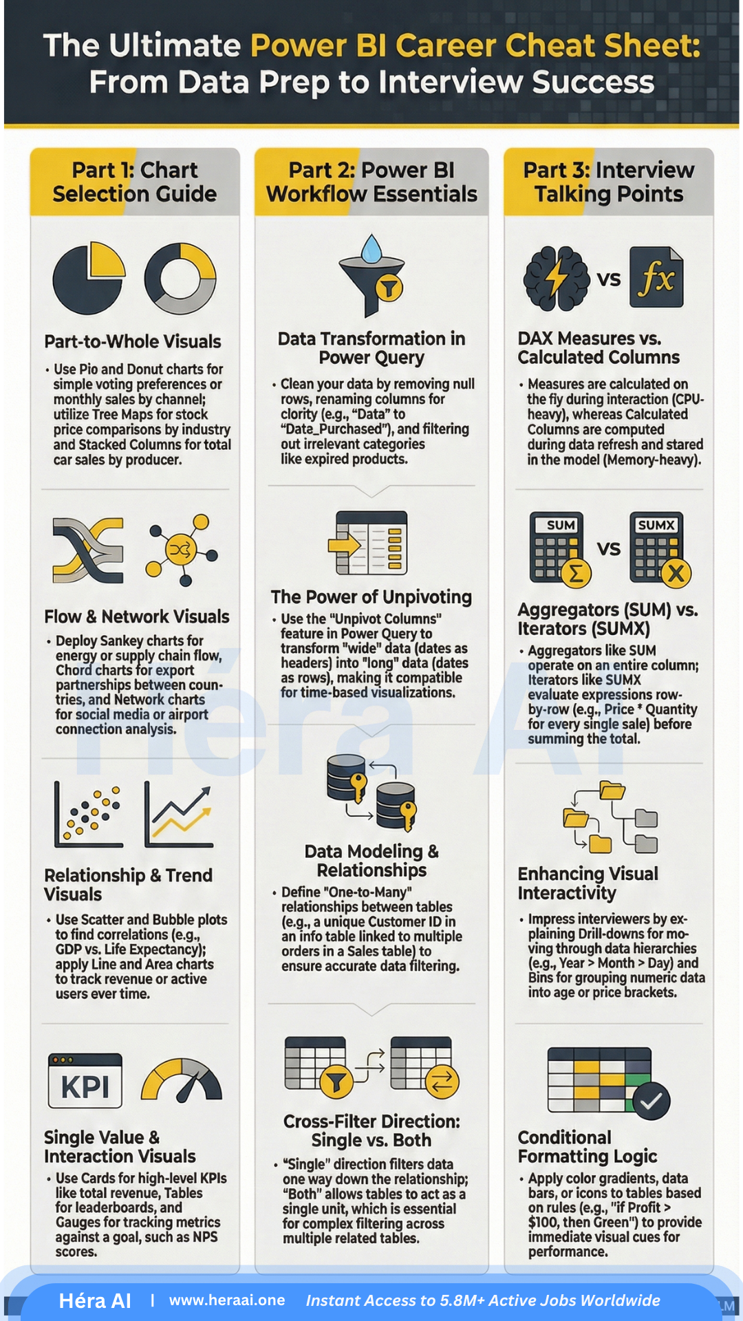
Pillar 01 — The Art of Visual Selection
The most common mistake in Power BI report design is selecting a visual for aesthetic reasons — a donut chart because it looks modern, a gauge because it fills space, a 3D bar chart because it appears dynamic. Each of these choices communicates something specific about the data, and choosing the wrong one is not a style error — it is an accuracy error.
The core principle: every visual type answers a specific type of analytical question. Matching the visual to the question is not optional for production reports. The table below maps each major visual type to its correct use case and the production decision note that interviewers will probe if you cite it in a screen.
The Sankey diagram deserves specific attention. It visualizes flows between stages — user journeys, funnel drop-offs, budget allocations — in a way that no other chart type replicates effectively. It's rarely used by junior analysts because it requires the data to be in a specific source-target format and the interpretation requires understanding proportional flow logic. Presenting one correctly in a portfolio project is a strong signal of production experience.
HéraAI interview technique: When asked about your dashboard design process, don't describe the visual — describe the decision. 'I used a scatter plot for this because I needed to show whether ad spend and conversion rate were correlated, and a bar chart would have masked the relationship by presenting them as separate metrics rather than paired data points.' That framing demonstrates analytical intent, not just tool familiarity.
Pillar 02 — The Power Query Foundation
Power Query is the transformation and modeling layer of Power BI. It runs before any visualization and determines whether the numbers in those visualizations are trustworthy. Most candidates understand it as 'where you clean data.' The technical screen is designed to determine whether you understand it as 'where you define the analytical truth of your report.'
A data model with incorrect relationship directions, unresolved data type issues, or tables left in wide pivot format will produce calculations that appear to work correctly in some views and silently fail in others. The ability to diagnose and prevent these failures is what interviewers mean by 'strong data modeling skills.'
The unpivoting operation is the one most candidates encounter first and understand least deeply. When a source dataset arrives with columns named 'Jan', 'Feb', 'Mar' — a common format for Excel exports — those months are data values, not column headers. Power BI's time intelligence functions require date values to be in rows. Unpivoting converts the wide format into a tall format with 'Month' and 'Value' columns, making the data compatible with DATEYTD(), SAMEPERIODLASTYEAR(), and every other time intelligence function in DAX.
The model design signal interviewers look for: Can you describe your data model without looking at it? If you built the report, you should be able to say: 'I have a Sales fact table with foreign keys to Date, Product, and Customer dimension tables. All relationships are one-to-many from the dimension side. I unpivoted the source data before loading because it arrived in pivot format from the finance team's Excel export.' That description tells an interviewer everything they need to know about your modeling competence.
Pillar 03 — Interview-Ready DAX Logic
DAX — Data Analysis Expressions — is the formula language that powers every calculation in Power BI. It is also the primary filter that separates junior DA candidates from mid-level and senior ones in technical screens. The reason is not complexity — the most important DAX concepts are not difficult to learn. The reason is that most candidates learn enough DAX to build a working report without ever developing the conceptual model that explains why it works.
The single most commonly asked DAX question in DA interviews is the distinction between a Measure and a Calculated Column. The table below maps the six dimensions of that distinction — and includes the interview test case that demonstrates the difference in practice.
The row context vs. filter context distinction is the senior-level layer of the same question. A Calculated Column has row context — it evaluates the formula for each row individually. A Measure has filter context — it evaluates the formula within whatever filter state is active in the report at query time. CALCULATE() is the function that explicitly modifies filter context inside a Measure, which is why it is the most powerful and most frequently misunderstood function in DAX.
The answer that closes the Measure vs. Calculated Column question: 'A Measure is evaluated at query time within the current filter context — it recalculates dynamically every time a slicer changes. A Calculated Column is evaluated at model refresh, stores a result for every row, and does not respond to filter context. I use Measures for any metric I want to aggregate or filter — revenue, retention rate, average order value. I use Calculated Columns only for row-level logic that needs to be available as a filter or axis value, like a profit margin category label.' That answer will pass any mid-level technical screen.
From Dashboard Builder to Analytical Decision Partner
The three pillars in this article represent the difference between a Power BI user and a Power BI analyst. A user builds reports that look correct. An analyst builds reports that are correct — where 'correct' means the visual choice accurately represents the relationship in the data, the model design ensures calculations behave reliably under every filter combination, and the DAX logic is explainable under technical scrutiny.
That distinction matters in interviews because it's the same distinction that matters on the job. Dashboards that mislead — through the wrong visual type, a broken relationship direction, or a Measure that returns unexpected results when a slicer is applied — create worse decisions than no dashboard at all. The hiring manager for a DA role knows this, and the technical screen is designed to surface whether you know it too.
At HéraAI, the Interview Cheatsheet Vault is built to develop exactly this level of tool fluency — not just how to use Power BI, but how to explain and defend every choice you make in it.